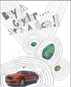
What you are viewing is a design for a Crysler ad, yes it is spelt "Crysler" and not Chrysler for a reason. The reason being is that even though gems are supposedly perfect there is always a flaw and even though a Chrysler is a gem it is no "perfect gem". The design is a outline of the car it self and the gems around it, this is to make the viewer look at the gems and the car right away. The lines proceeding to and from the title is to have the viewer look from the car to the gems to the title allowing the viewer to read the title and understand it after taking in the images on the advertisement. The Black and White theme to the title was to make the car and the gems "pop" out of the image.
I learned that even just a bit of black and white in the title can make a image/paper really stand out due to balance. Along with how having everything but the car and the gems white or black can make the image "pop" out. I realized that even just a few outlines and lines to divide up the image can make a plain piece of paper into a interesting design for a, well made advertisement!
I learned that even just a bit of black and white in the title can make a image/paper really stand out due to balance. Along with how having everything but the car and the gems white or black can make the image "pop" out. I realized that even just a few outlines and lines to divide up the image can make a plain piece of paper into a interesting design for a, well made advertisement!
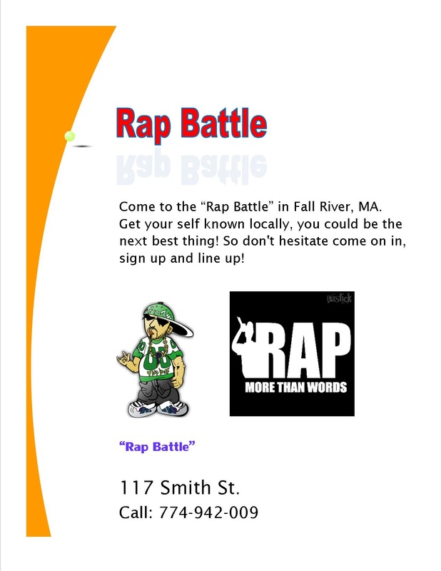
Flyers are used to promote a variety of different things. I made three Flyers all consisting of two different topics and many colors, along with informational writing explaining the promotional topic(not actual promotional topics). Flyer One is a promotional flyer for a "Rap Battle" where you would go to rap and meet other people. As well as experience something new that you might not get the chance to regularly.
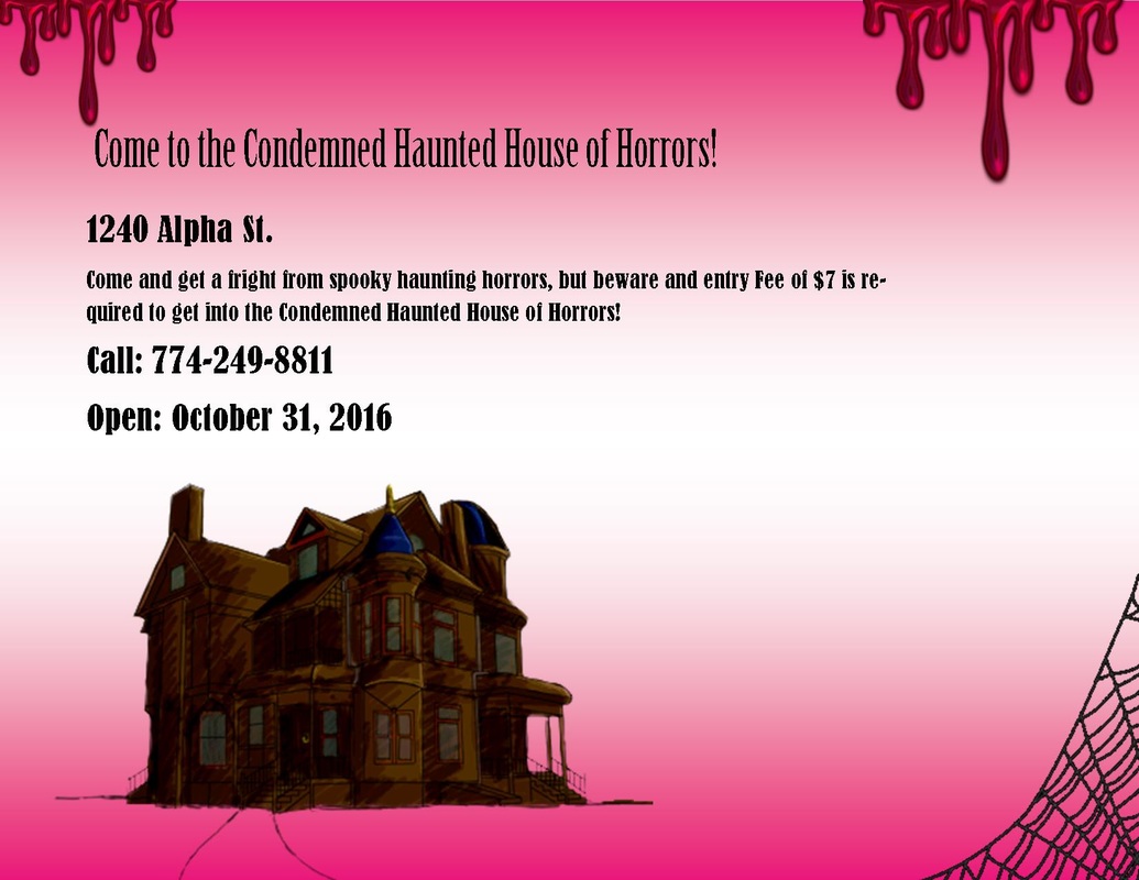
Flyer Two is a promotional flyer for a "Condemned Haunted House of Horrors" where it explains how there will be many frightening horrors. There is information describing where and when the Haunted House will be open as well as a number to call to ask any questions.
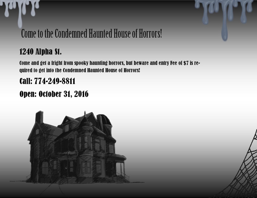
Flyer Three as you would have guessed is a promotional flyer for the same "Condemned Haunted House of Horrors" but... this flyer is black and white. This flyer is a replica of the first one but with a darker background and gray goo instead of red blood. The color suits the theme of the flyer very well I think.
These are only 3 examples of some flyers but many more can be made and in many complex ways!
Flyer Two is a promotional flyer for a "Condemned Haunted House of Horrors" where it explains how there will be many frightening horrors. There is information describing where and when the Haunted House will be open as well as a number to call to ask any questions.
Flyer Three as you would have guessed is a promotional flyer for the same "Condemned Haunted House of Horrors" but... this flyer is black and white. This flyer is a replica of the first one but with a darker background and gray goo instead of red blood. The color suits the theme of the flyer very well I think.
These are only 3 examples of some flyers but many more can be made and in many complex ways!
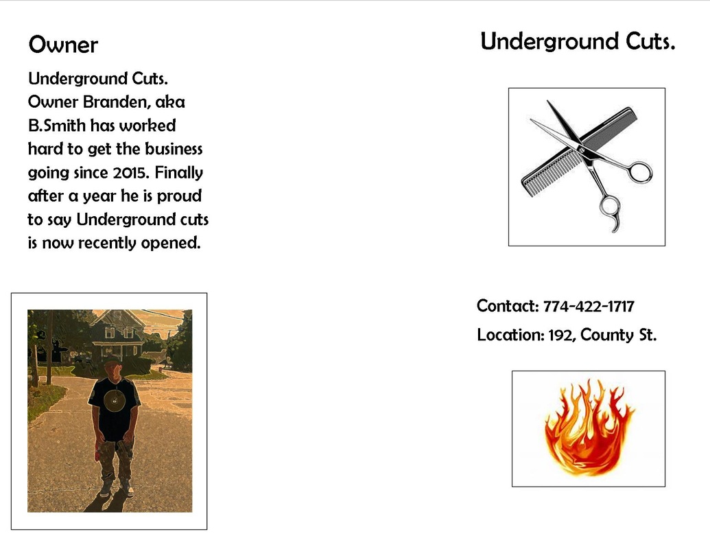
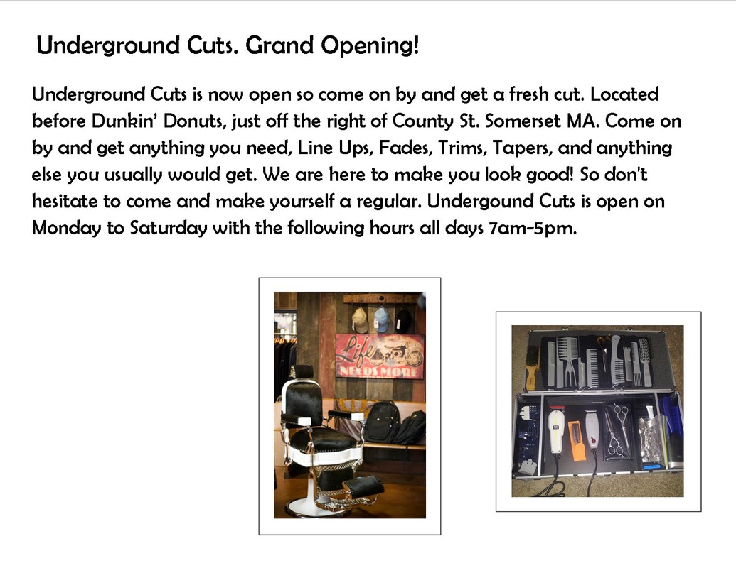
Above is a brochure for a business named Underground cuts. The brochure is used to quickly get people to see your business, topic or subject and get what you need projected put out. The brochure has headings on every page and images to show the viewer important and significant things about the business. There is necessary information on the front page along with the title itself. The inside front page is a description of the "Owner" (me) and a portrait. The inside of the brochure itself is a width long page describing the business and all the related topics of the business As well as in the inside there is a image showing the utensils used and inside "Underground Cuts." itself. This is a "perfect" example of a brochure for business related situations.
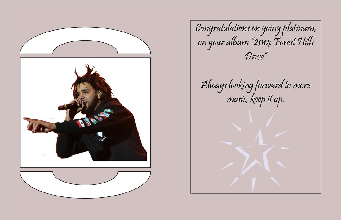


Above is a greeting card. Greeting cards is a easy way of letting someone know something or to send the card with a letter. The card above is of a Musical artist of the name J.Cole and would let him know congratulations on going platinum with no features on his album. The card features a font cover with J.Cole on it and the top heading. The middle pages feature the main message that is trying to be said, along with another picture. The back page is blank with a plain color. This above is a very good example for a greeting card.
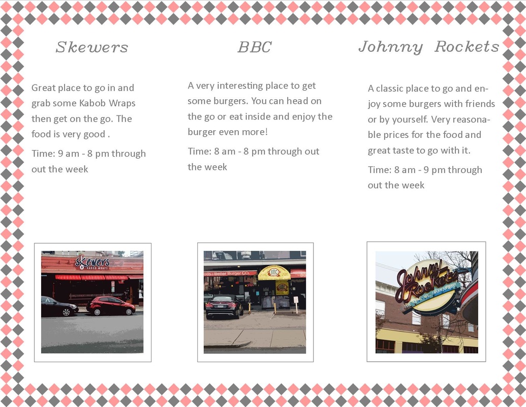
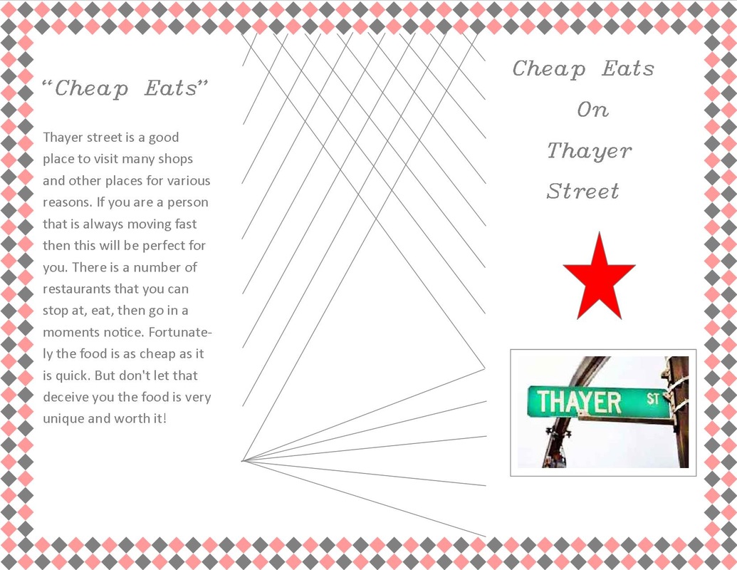
Above is a brochure for Thayer St. in Providence, RI a place of many different shops and stores. The brochure is marketing for cheap eat food restaurants such as Skewers kabobs, Better Burger Co., and Johnny Rockets. Each Section of the brochure has brief informative descriptions of the business. There is also the time displayed on the brochure. The locations is on Thayer St. itself. The front page has a section of the page talking about cheap eats around Thayer St. The cover page is featuring the street sign of Thayer street. This was the brochure for Thayer St. "Cheap Eats"
