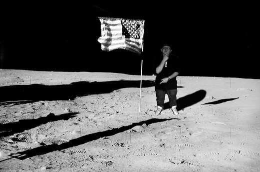
The image above is the "imagine you were there" project. I had to put myself into a picture that the original image wasn't in. So I took a image of me, and then I looked up a image of the moon with the American flag. After that all I had to do was add myself into the moon background, then turn the image to a gray scale. Then I added a shadow behind me to make it look a little more realistic. This was my "imagine you were there".
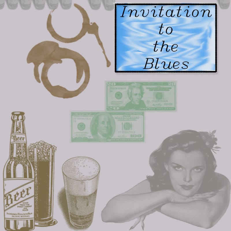
The album cover is a made cover by me showing most topics and subjects touched upon in the song " Invitation to the Blues". I used a gray gradient color to fill up the background. I used different brushes to add the woman, beer, money, and coffee stains. When I made the title I useda italic font and made a box around it bold. When I added the blue colors in the back of the title I then used the smudge tool to create the sway look to the colors. For the back of the cover I added the darker gray gradient color and added oriental borders on the top and bottom in between the lyrics along with my intials on the bottom hand right. This was the invitation to the blues album cover.
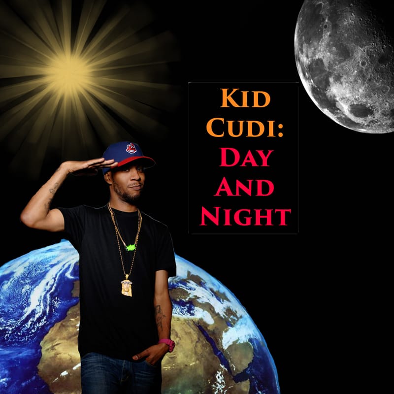
The created album cover above is of Kid Cudi's featrued song Day and Night. The song was released in 2008. When I created the album cover I used brushes consisting of a sun and moon. Then I got a image of the earth in space and put the image behind the artist Kid Cudi. I used red and orange for the title of the album cover giving a nice popping look with a black background. Then I went to the back of the cover and added a easy flat white color and added lyrics to the song. This was my created album cover for Kid Cudi's Day and Night.
|
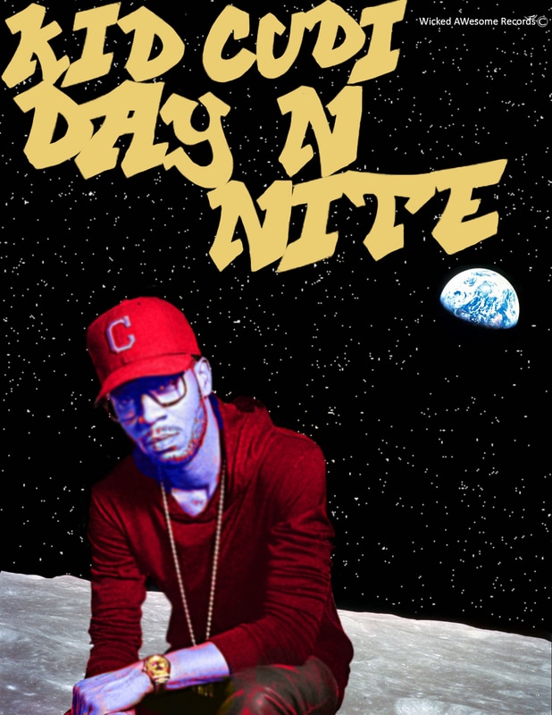
The image to the left is a shirt design for the album cover above of the song "Day n Nite" by Kid Cudi. To make the design I used graffiti bushes then filled them in with a nice easy yellowish-gold color. I added a cluster of star in the back to symbolize that the design is in space. Then I added the moon and the earth in the background and since I wanted a focus on the earth and moon I sharpened the two. After that I added a picture of Kid Cudi and trimmed the image. I then used the color replacement tool to make the artist look blue while his clothes are red and his watch is gold. I did this to make the image pop and correlate with the title heading. After that since I sharpened the moon and earth I blurred the artist a little to make it seem more focused on the earth. That is how i designed the shirt design.
|
